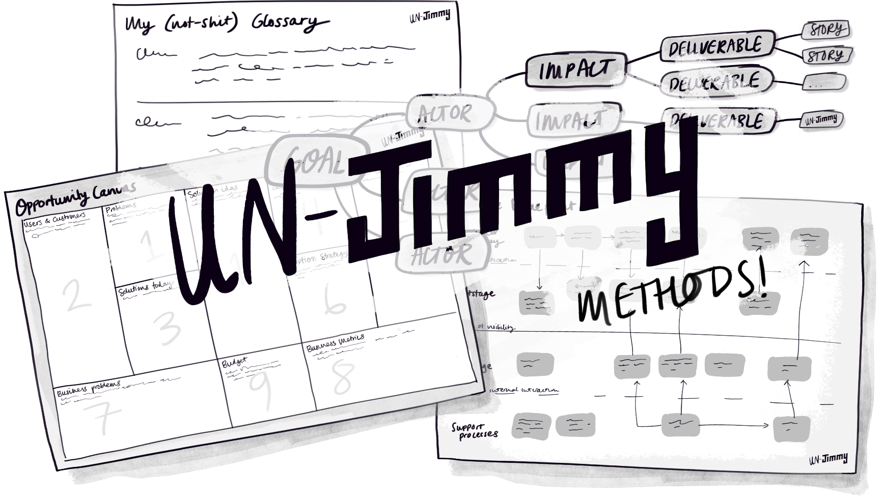
The un-Jimmy methods!
Or, things I reference when doing business analysis
Want to be more BAweome™? There are many techniques and tools that can help—including the Jimmy Methods.
The Jimmy Methods were never intended to be the exhaustive list of BA methods (that would be a fool’s errand). I simply chose to create them to fill what I saw as a gap for easy-to-use how-to guides for common BA activities.
But plenty of excellent content and techniques remain that are great resources—tools and techniques that I use regularly and rate highly, but which don’t make appearances as a Jimmy Methods. I believe that you’ll find them useful, too, and, happily, all are free!
Here, then, are the Un-Jimmy Methods!
TL;DR:
⮑ Use the Opportunity Canvas &
Impact Mapping for backlogs
⮑ Use NNGroup for UX and
WCAG for accessibility
⮑ Use ConceptSpeak
for writing great definitions
⮑ Use a Service Blueprint
for complex systems
Navigating this page
To make this page easier to navigate, I’ve divided it into key BA focus areas—feel free to skip directly to a topic of interest:
❶ Building a backlog
❷ Getting the user experience right
❸ Writing (not-shit) definitions
❹ Tying it all together
❺ Closing remarks (& the Internet is your friend!)
Disclaimer: These are the methods I use most, but which haven’t been addressed as a Jimmy Method. There are many other approaches out there, and plenty of reasons why some of the approaches linked in this article might not work in your context. So as with everything in life, apply mindfully!
Note: I’ll endeavour to keep this up to date should new or different techniques surpass the ones listed here.
Building a backlog
Scoping and defining features is the bread and butter of agile business analysts, so it is helpful to have a couple of go-to techniques in your back pocket, ready to throw at any situation. The ones I love and reuse all the time are: the opportunity canvas, impact mapping, and story maps.
For working out what features you could or should add to your system, the opportunity canvas, and impact mapping (or a combination of the two!) will ensure that you and the team are making purposeful decisions.
But for analysing a whole new system, I tend to use story mapping because it helps you to ensure a functionally complete system. Story maps are captured in a Jimmy Method (with lots of credit to Jeff Patton who came up with the approach). So I’ll focus on the other two in this article.
And my advice on which tool to use when? Simply go with the one that you think will generate the most engagement with your stakeholders.
1. Opportunity canvas
Probably my all time favourite and most-used tool is the opportunity canvas, which was created by Jeff Patton, who describes it as follows:
[A] one-pager that you’d use to unpack your beliefs about a new feature or capability you’d like to add to your product. If you’re responsible for the success of your product, or just don’t like wasting time building things without knowing why, this will help.
Use it whenever you are trying to understand a problem and you’re scoping out possible features. It is surprisingly easy, and, handily, Jeff Patton’s website has a page that contains everything you need to know about the opportunity canvas including instructions, background, and more!
I actually can’t stress enough how powerful and versatile this tool is. For example, if you are building your product backlog, then check out how Teresa Torres takes the base unit (the canvas) and uses it to build what she titles an ‘Opportunity Solution Tree’. Brilliant!
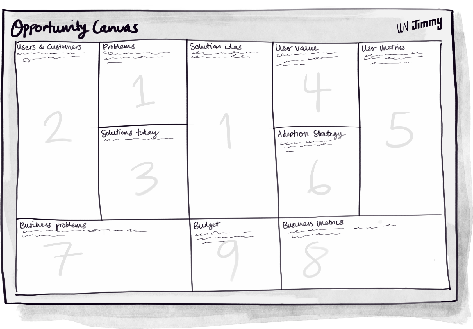
Things to keep in mind when opportunity canvasing (based on my experience):
The best outcomes with opportunity canvases happen when you work on them with your development team as a collaborative scoping exercise. The opportunity canvas is most effective when used early in the process. If it feels like a documentation exercise rather than a creative one, you’ve probably left it until too late (which is surprisingly easy to do)!
And a word to the wise—I have historically taken creative liberties with the opportunity canvas and edited it to suit my particular context. Through trial and error, I have found that this was most successful when the edits were minor and simply made the process easier for the team. Wholesale edits were less successful 🫠.
Remember, the opportunity canvas approach assumes that the organisation and the product already exists—which is usually the case for work assigned to a BA or a team with a BA. But if your context is different, then never fear, you have plenty of options…
Canvases for everyone!
Now we all know that there is a canvas for everything, but there is only one canvas that I think is worth mentioning here: The lean canvas. The lean canvas is basically a start-up friendly adaptation of the business model canvas to help you to validate and elaborate your start-up idea into something meaningful.
Just google “lean canvas” and you’ll find heaps of resources!.
2. Impact mapping
Impact mapping is one of those techniques that, even if I’m not using it directly, has influenced how I approach analysis. Created by Gojko Adzic (of spec-by-example fame), it is a simple yet insanely powerful method to make sure you are building the right things.
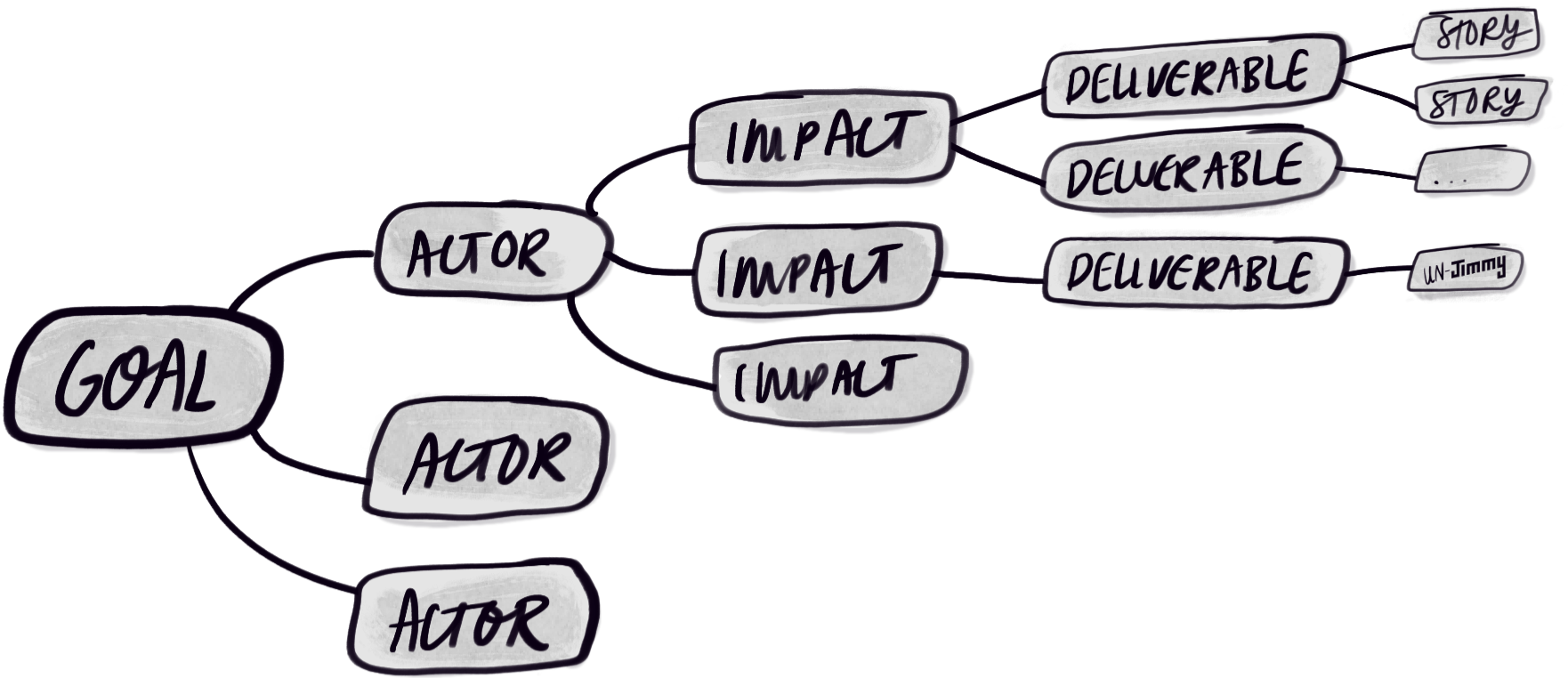
The reason impact mapping is such a powerful tool is because it links functionality directly to goals. Think of it as benefits mapping for your backlog!
Gojko has an impact mapping website with lots of links to resources, talks, and articles about the technique. There is help for every type of user from beginner to consultant, so it’s the best place to start for anyone.
Here’s what Gojko has to say about it:
“Project plans and requirements documents are often shopping lists of features, without any context why such things are important. Without a clear mapping of deliverables to business objectives, and a justification of that mapping through impacts that need to be supported, it is incredibly difficult to argue why certain items should or shouldn’t be invested in. In larger organisations with many project stakeholders or product sponsors, this leads to huge scope-creep as everyone’s pet features and ideas are bundled in.”
Yup. I’ve seen that 👆. A lot!
And for my part, I’ve found this technique most powerful when used with key stakeholders to help them to provide input to, and really understand, a product backlog (and the compromises/decisions that they are making).
Plus: Mind-maps are pretty! 🌈
Getting the experience right!
Speaking of pretty: If you’re working on stuff with some kind of user experience (UX) component—whether it be a service, UI, product, or otherwise—you need to understand your users well.
You need user research!
4. User research
For information about users and their behaviour online, you should always start with the Nielsen Norman Group (NNGroup)!
They call themselves “world leaders in research-based user experience” and it’s no joke. If you’re anywhere near UX or service design, NNGroup have probably done extensive research on it, which they share in articles, videos, and more…
For example, are you considering a sticky menu? Then here’s an article that summarises everything you need to know about sticky menus. Or maybe your designer is proposing a non-standard logo placement. NNGroup have done research on the impact of logo placement on brand recall for you. Maybe you’re redesigning how you present taxes and other fees in your shopping cart? They’ve already done some deep thinking about ecommerce for you.
Now I’m not saying that this gives you ALL the answers—context is important after all—but it can save you from wasting money discovering something that is already well established.
In sum: It’s my go-to starting point for any UX or service question.
5. Accessibility
Accessibility is a lot more than just adding “alt” text on images. Much, much more. Honestly, accessibility is a whole speciality in it’s own right, but—and hard-core personal opinion here—if you and your team are working on customer facing interfaces, you should have at least a passing familiarity with the current standards for web accessibility. The whole team should. Ideally, you’d have access to a real accessibility expert, and regular accessibility audits. But I digress.
If you’re working anywhere near a regulated industry or government, then there is a good chance that your project or product will need to adhere to the Web Content Accessibility Guidelines (WCAG), other mandated guidelines, or both. There is a lot there, and honestly, between the ugly, legalistic format and the sheer volume of content, it is hard to take in, so I’d recommend govt.uk’s summary of WCAG 2.2 as a starter.
And if you have not been exposed to web accessibility before, the W3C has this handy starter page just for you!
But let’s get back to BA basics…
Write (not-shit) definitions
We business analysts spend our days defining things. And defining things is hard work. Luckily, there’s help.
6. ConceptSpeak
Ronald, together with his consultancy, BRSolutions, has been the authority for business rules for ages. They also created ConceptSpeak™️—a framework to help you to create better, more usable definitions of concepts.
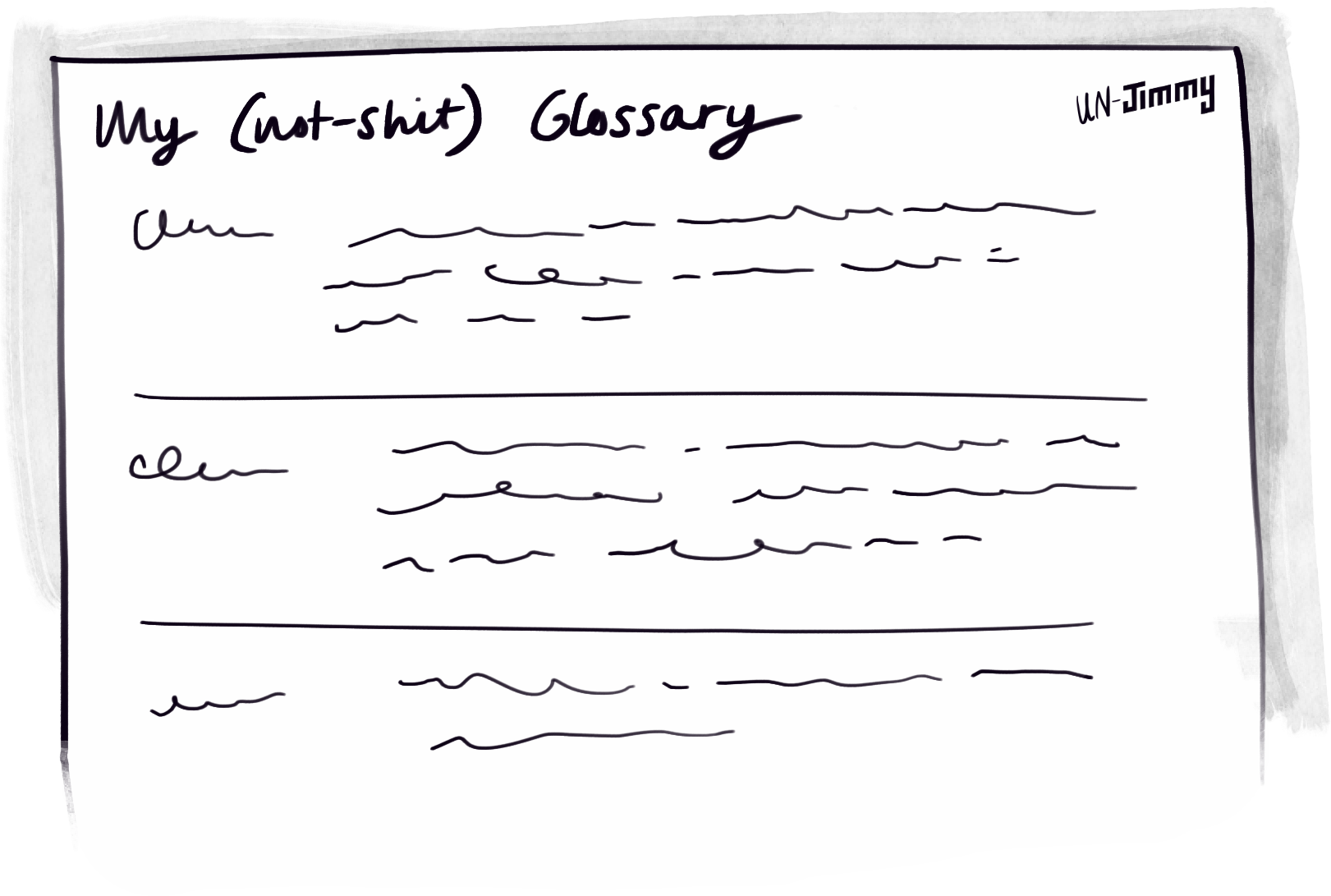
Better still, there’s a free downloadable white paper that is essentially a standalone cheat-sheet for writing useful definitions. It is the paper you don’t think you need until you read it and you suddenly realise that every definition you’ve written—that you thought was so clear—was probably shit (speaking from personal experience here 😭).
It is a truly great resource! It has good and bad examples of all the guidelines, which really helps you to see the difference. Here’s an example guideline pulled from the primer to give you a flavour (it is literally the first guideline, which proves that I didn’t have to look hard to find goodness):
“A definition should express what a thing is, not what it does. So the first significant word in a definition should be a noun or noun phrase rather than a verb. This noun or noun phrase is called the kick-off word.”
So, if you’ve been tasked with compiling a glossary, or you are having to define new concepts as part of your work, or your glossary is nonsense and you’re trying to clean it up, then you need the ConceptSpeak primer.
There’s really not much more to say. So moving right along…
Tying it all together
I love the complexity of working across multiple systems, touchpoints, and domains. Except that tying all that complexity together is hard work!
I have two go-to tools I use when wrangling the big picture stuff: concept modelling and service blueprints. Now there’s a Jimmy Method for concept models, but service blueprints are an entirely different kettle of fish: probably the most complex (and therefore most powerful) of the un-Jimmy Methods.
7. Service blueprint
The service blueprint is a tool that is usually considered part of a service designer’s toolkit, namely, service blueprinting, but I reckon that we BAs should steal it.
When dealing with a lot of complexity, service blueprints are an awesome way to anchor your thinking without getting too wild or losing the customer in your analysis. Simply put, it is a tool that directly links analysis—process, data, and systems—to a customer outcome! How cool is that? 👏
Since being the BA-sidekick (rather a while back) to a UX-er who was using a service blueprint to analyse an onboarding process for a large company, I’ve been hooked.
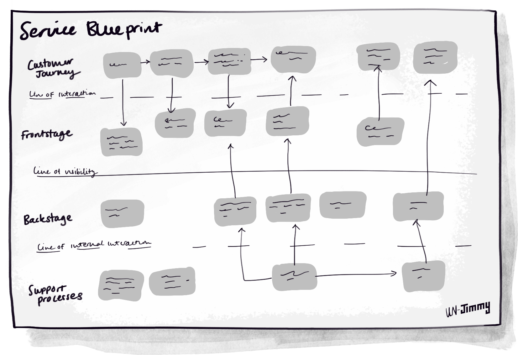
The service blueprint provides a structure and an approach to orient everything you do toward the customer (i.e., customer-centricity), rather than toward the organisation and systems. I cannot emphasise enough how much this one tool has changed my analysis approach for the better. Even when not doing service blueprinting per se, I’ve found myself using the Frontstage and Backstage constructs in much of my analysis.
NNGroup (yes those guys again) define it as:
“the activity of planning and organising a business’s resources (people, props, and processes) in order to (1) directly improve the employee’s experience, and (2) indirectly, the customer’s experience.”
Pretty much everything you might ever want to know about service blueprints is collated in NNGroup’s Service Blueprint study guide.
In my experience, no two service blueprints look quite the same—which is fine because I think that success is being able to visualise all the moving parts, not necessarily to adhere to some arbitrary standard (but I know a few designers who would disagree strongly with that opinion!)
Closing remarks
There you have it! Those are the un-jimmy methods that sit alongside the Jimmy methods.
You now know all my secrets and can steal my job!
Now obviously this isn’t an exhaustive list of ALL the techniques I use, but simply some of the most important ones that I go back to time and time again.
And my best advice is, if one of these isn’t appropriate in your context: Just google it.
“The internet is your friend!”
Please do hit me up on Linkedin or by email if you have any feedback! I’m always up for random questions, and I’d love to know if you think there are better tools I should be using!!!